
Choosing a Background Color for Your Custom Pet Magnet or Coaster
Published 2026-09-18
Start with a background that separates your pet from the surrounding color, then check name readability. Compare cream and muted green and understand white versus transparent artwork.
Artwork generation is available. Upload a photo and choose an available style. Each successful artwork uses 1 Ink point; failed generations return their reserved Ink points. Payment is not open yet. Check each product's page for its current design and order-submission availability; outstanding specifications are confirmed before production.
Which Background Color Should You Choose?
Choose a background that keeps the pet's face and coat edges easy to distinguish. A light neutral is a useful starting point; compare it with a muted color while keeping the same artwork, shape and placement. If you add a name, check that its letters stand out against the color behind them. If the artwork has an opaque white background, changing the product color will not remove it.
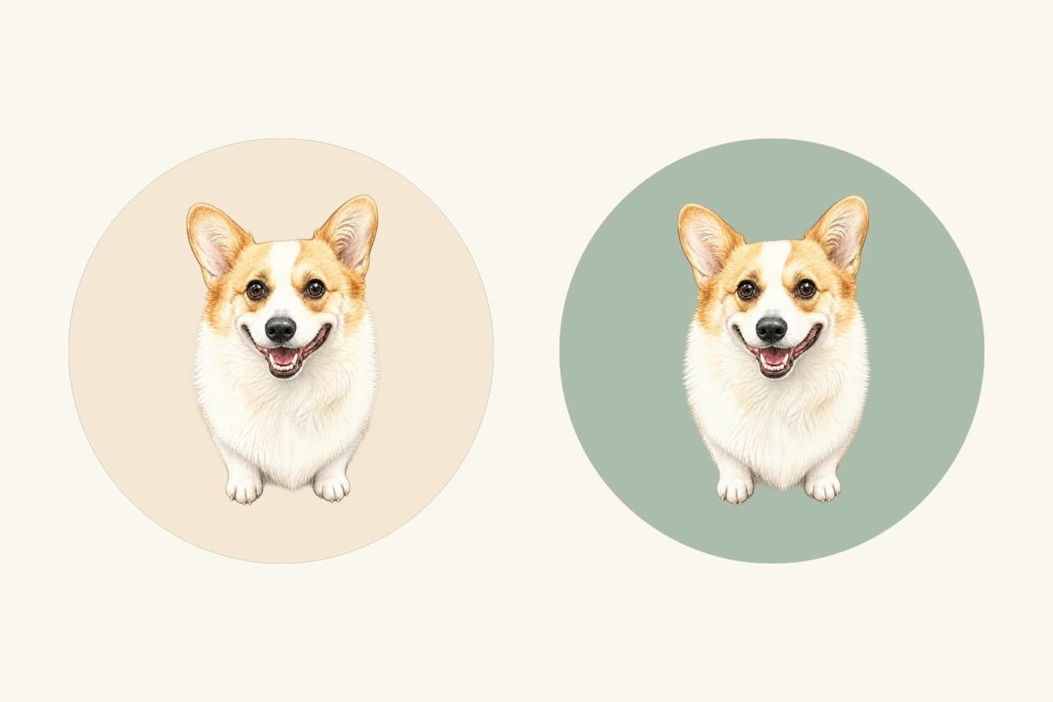
The comparison above shows the same corgi illustration in the same round coaster layout, with cream on the left and muted green on the right. The illustration was prepared with a transparent background for this guide, then placed with the site's ceramic preview component. These are two-dimensional design previews, not photographs of manufactured samples or a demonstration of automatic background removal.
TailGift's ceramic magnets and coasters currently support design and saved quote previews while samples await confirmation. Ceramic order submission and real payment are not open. Use this guide to review your design choices, rather than treating a preview or quote as a purchase.
Check Contrast Around the Features You Want to Keep
Look at the ears, muzzle and outer edge of the coat. If those areas meet the product background directly, a similar tone can make their boundaries harder to distinguish. Light fur against a very pale color may look gentle but lose definition; dark fur against a dark background may make the silhouette less clear.
Try a background that gives the important edges enough separation, then look again at the eyes and expression. You do not need the strongest possible contrast everywhere. The useful choice is the one that keeps the pet recognizable without drawing more attention than the portrait itself.
If your artwork already contains an opaque background, that image background is what sits directly beside the fur. Changing the product color outside the image will not change that internal contrast. Check the image first before expecting a color adjustment to solve a faint outline.
Compare Two Colors Without Changing the Layout
Keep the artwork, shape, position and scale the same while comparing background colors. Otherwise, a larger face or a different crop can distract you from the color decision. In the example, both previews use exactly the same placement; only the product background changes.
The cream background sits close to the corgi's warm tan coloring and makes the surrounding area feel quiet. The muted green gives the pale chest and warm coat a more distinct surrounding color. Because this prepared illustration has transparent areas, each background is visible around its outline. Neither version recolors the fur.
Begin with two options instead of trying many unrelated colors at once. Compare a light neutral with one restrained color drawn from, or chosen to complement, the artwork. Then view each layout smaller on screen. This helps you judge the balance of portrait and surrounding space, but it does not establish the finished physical size or printed color.
A White Background Is Not a Transparent Background
White pixels remain part of an image even when they look like empty space. If a square artwork has an opaque white background, placing it on a green coaster layout leaves a white square over the green. The colored background does not replace those white pixels.
A genuinely transparent image behaves differently: the product background can show through the transparent parts, as in the prepared comparison above. An image's file extension alone does not tell you whether it has transparency. A PNG or WebP can still contain a fully opaque white background.
Use the actual preview to see what your selected artwork contains. Changing a ceramic background color does not remove the image's own background, and this guide does not assume an automatic background-removal step. You may prefer to keep the white panel deliberately, choose a pale surrounding color, or select another existing artwork whose background already suits the layout.
Give the Pet's Name Its Own Readability Check
If you add a name in the ceramic editor, check its spelling and text color separately from the portrait. A dark name can be easy to read on a light background, while a similarly toned name and background can blend together. Judge the contrast where the letters actually appear, not just from the color controls.
Review the whole preview after adding a name. The ceramic layout makes room for lettering, so the portrait can occupy a different area from the version without a name. Check that the face still has enough space and that the name does not compete with an important feature.
The comparison image intentionally has no name, so it isolates the background-color choice. Your own lettering needs a separate review at a smaller screen size. Legibility on screen is a layout check, not a guarantee of final print sharpness.
Review the Shape and the Whole Set
A circular boundary can crop the corners of a square image as you enlarge or move it. Before saving, look for clipped ears, decorative marks or lettering near the edge. Reducing the artwork slightly can give it more room, although it also reveals more of the product background.
Review a magnet in the shape you actually selected rather than relying on the round coaster example. For a four-coaster set, check each piece individually and then look at the set together. Repeating one background color can help different portraits feel related, but each pet and any name still need enough contrast.
Avoid treating an edge guide or a nominal size as a confirmed production specification. Ceramic samples are still pending, so the preview does not establish relief height, heat resistance, grip, cleaning performance or delivery timing.
Save the Version That Makes the Pet Easy to Read
Before saving, check that the intended artwork is selected, its white or transparent areas behave as expected, the pet's important features remain visible, and any name is spelled correctly and readable. Make one final comparison with the same layout and your alternative background color.
Open Shop and choose the available ceramic magnet or coaster design preview to review these choices in context. Save the design and review the current quote information if you want to keep it. A saved ceramic design or quote is not a submitted or paid order.
Using an existing artwork and adjusting its layout or colors does not request a new artwork generation. If the portrait itself needs to change, return to the artwork and photo guidance first; a product background color can improve the surrounding layout, but it cannot repair details inside the image.